 On my first look of this double page spread it just looked way more interesting than the others. Firstly looking at the top of the left hand page the designer used a serif font which looked similar to one that you would see on a poster for a circus. This could have possibly been used to show Lady Gaga’s personality through a font; this could be a very useful technique if I’ am doing an interview of a singer with a lot of personality. Also to make this double page spread look a little more interesting the designer has ordered the image so it takes priority over the text at the very top of the left and page and also the stylish border surrounding the whole two pages. Making the Lady Gaga image oversized gives the whole DPS something extra to make your eyes drawn towards it.
 While still focusing on the left hand page the font that is mainly used is a sans-serif font to possibly make the writing bolder to stand out from the image behind. This could be a good way of drawing the readers eye to the parts you want them to read the most; which Is what I may consider doing. The red sans-serif font is a great way of displaying the artists name to show the reader who the article is about, and by doing so a black smaller sans-serif font is added just underneath ‘what I’ve learned’ to stand as a slogan from Lady Gaga herself. Unlike Mojo, Q seems to want the reader to know who the interview is about; which in my opinion is the best way, this could be a good idea for when I make my own. Following on from this I really like the way the zig zag line is joining both pages together to look like they are joined. This technique may inspire me to do something similar in the next few weeks. Also the same as Mojo, Q adds their own logo in the bottom of each page beside the page number to add that little extra something; along with their website address for commercialism.
For Q’s right hand page they only seem to use 2 colours (black and red) with the small exception of white for the page numbers inside the black boxes. This works really well for this magazine as it is closely connected to the left hand page. To give this double page spread a variation of fonts the whole right side is serif font to make it look a little more formal. The only way the designer varies the font is by changing the colours. The sub – headings are in red to make them stand out from the main body of the interview. The red text is from the interviewer and the black is from Lady Gaga; this is a good way of separating out each section of the interview which could be an idea for my DPS.
At the top of the page the main heading is an introduction from the interviewer about Lady Gaga which stands out greatly because of the larger font size. Below this there is writing in a smaller serif font introducing the photographer (portrait) Rennio Maifredi and the interviewers name in also in bold Rupert Howe. This in turn adds a little something extra to making this double page spread so classy.
Finally in the center of the right hand page there is a bold red serif font, larger than any other on the page with a statement from Lady Gaga saying what she wants the most. “My ultimate goal? I want a Lady Gaga exhibit at the louvre.” Just by adding this makes the double page spread that little bit more interesting giving us an insight into what Lady Gaga wants from her career.
NME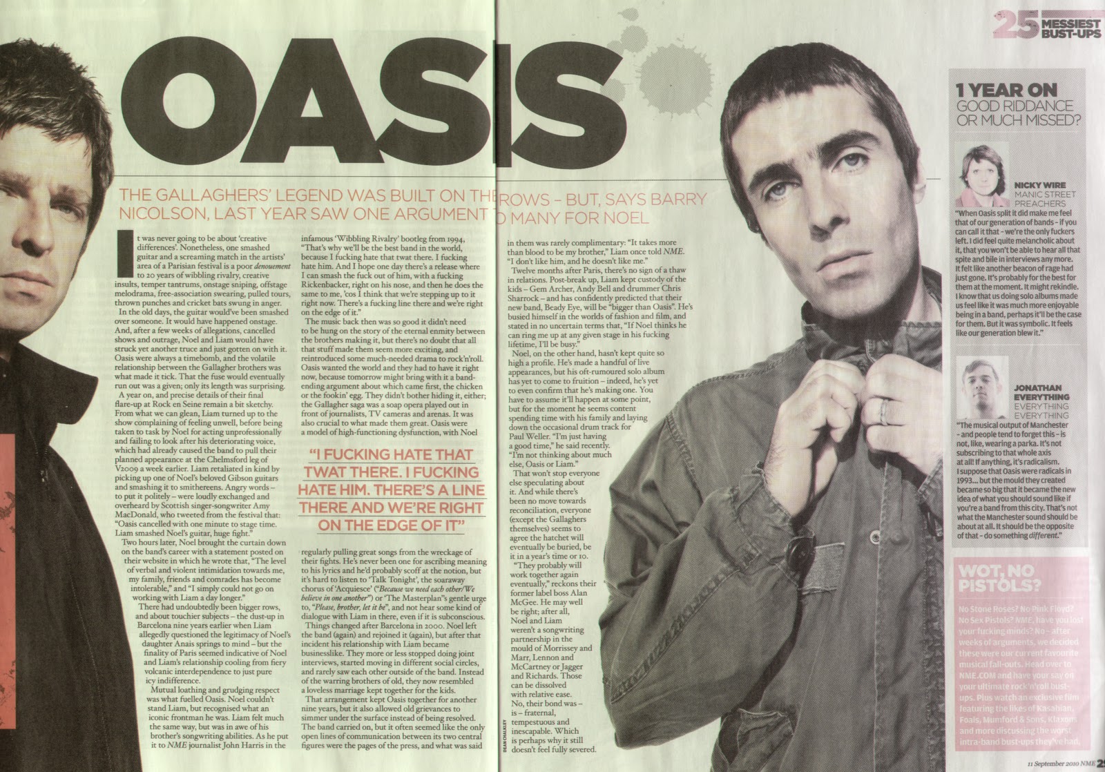
Furthermore by adding the black horizontal line above the standfirst gives the double page spread as sense of less chaos so everything isn’t clumped together, this also works with the separation of the second column by adding a comment from the lead singer of Oasis; which has been highlighted in red and underlined to show the reader this is important statement to read and has some significance to the article, which could be a good idea to add into my music magazine. Although strangely there is a grey and red box on the right hand side of the right page, this is unusual for a NME magazine to do as I haven’t seen it in past DPS. The boxes are mainly there to give extra information about other artists that may not have been mentioned on other pages. This could be a good way of adding in extra information but I’m not sure if for my music magazine that the added box will detract the attention away from the main story. On the other hand this DPS is in a way a lot different from others of NME, normally the band or artist is either on the right or left page with the writing on the opposite; but here the artists are surrounding the interview almost showing that they own this page. Other conventions that are similar to past music magazines I have analyzed are the bold ‘I’ at the start of the 1st column, this just adds a little something extra to not make the article appear boring or the band for that matter.
Finally while looking closer at the double page spread I noticed a piece of text saying ’25 messiest bust-ups’, this give the reader a little insight into what the DPS will be about before they start reading; it also that professional touch and shows the designer hasn’t missed anything out and allows the article to be read with ease. As normally seen on any page in a music magazine there is also a page number locater in the corner of each page along with the logo of the magazine; this is a definite must for my music magazine as it can allow the reader to find the page they are looking for easier.
NME
While analyzing this double page spread I found certain aspects of it to be very appealing and this gave me some inspiration for mine also. Parts of this magazines spread that I loved were the way the designer used the 3 column rule; this in my opinion gives the magazine a professional edge and makes it a lot easier to read therefore making it more appealing to the reader. For my double page spread I will certainly use this rule as I think it will create that professional and modern style to my magazine. Furthermore another aspect of the spread that will appeal to my style of magazine is the standfirst just below the bold heading. I love it how the font changes from sans-serif to serif while not detracting the eyes attention away from the smaller fonts below. The serif font will defiantly appear in my magazine as I want to really relate my indie pop magazine well to my main inspiration NME.
On the other hand I’m not too keen on the “Now we’re dickheads with synths” taking over the top 5th of the page, this space could have been used for a title introducing the reader to the band; in this case The Wombats. Instead the band’s name is in a smaller serif font below the title. Keeping with the ideal double page spread the picture spreads over the whole left hand page, but also connects to the right hand side page because of the similar colour scheme between the sky of the picture and the page colour of the right. Showing that both band and writing are connected through correlating backgrounds. This technique in my eyes works very well and may come up in my DPS also as it seems to work well with lighter backgrounds.
To start off The Wombats article the first column begins with an oversized O, in my opinion I think this gives the band a slight edge and makes the readers eyes know where they need to start reading just from the bold sans-serif font used. This use of variety could also appear in my magazine to add a sense of excitement and make the reader think of it as an NME magazine with an added touch.
Finally, one of the common tactics used by the designers of the NME magazines is to stick with a specific colour scheme so the page doesn’t look to over busy. By doing so designers only use a maximum of 4 colours, in this case of The Wombats double page spread they only use black, a slight aqua blue and possibly white; this use of 3 colours is continually based through all NME magazines and would be a great idea for my own magazine.
Mojo
 While analyzing the double page spread interviewing Paul McCartney I noticed Mojo’s choice of lay out and colour scheme was a lot more basic than the others I had analyzed. The typical codes and conventions are totally different from the regular standard ones we see in other music magazines; but this is what makes this double page spread so interesting. Firstly instead of having the typical 3 column convention this magazine designer has only gone for two; this may work in this DPS but I’m not entirely sure it will in mine. On the other hand I do really like the added touch of the large R and F as a new paragraph begins; this is rather common for a designer to do to just give the DPS a little bit more creativity.

Still focusing on the left hand page where I was particularly focused on the line ‘StartingOver’ normally in a music magazine that would span over the whole of the top 5th of the two pages; but that’s what makes this DPS so rare the designer has added more of a 80’s style taking us back to McCartney when he looked like he does in the image on the right page. Furthermore the colour scheme does fit the style icon of a music magazine by having the three colours. (white, green and black) This works effectively by contrasting the white and green against the black background, and therefore connecting the green to the logo of an apple in the top left corner. Under the heading Starting Over which is in a sans-serif font there is a block of text (a standfirst) which gives the reader a brief outline of McCartney’s life and what he told us. This block of text is a good idea to start off an interview by just giving the reader a brief insight to what the interview is about; I may decide to use this technique for my DPS. The font used for this block of text really makes it stand out the serif italic font is a great technique used for a chunk of text when someone is talking; it will really grab the attention of the reader and create a diverse font scheme.
Finally moving onto the right hand page, where the colours are very dark and there isn’t that much brightness in the image it’s self. Although the black shadow at the bottom of McCartney almost connects with the background of the text on the left page; I really want to try and achieve this technique used by the designers in my double page spread. Even though the image of Paul McCartney is very dark it almost looks like it’s supposed to be that way to show the reader it connects with the block of text on the left hand page. Overall this is a very simple DPS design but in some ways works very well as a comparison to some of NME’s double page spreads; where they are a little more outgoing.
While analyzing this double page spread it appeared to be very different from a typical DPS, normally there are 3 columns to the right hand side giving a interview with the band or info if they are new to the charts. This in my opinion doesn’t work as well as is seems to be more restricted and squished to one side. Another part of the right hand page I wasn’t to sure about was the aqua blue circle in between both columns giving a small statement. “B&S began the left-field holiday camp” Although this adds a little something more adventurous to the right hand page it just doesn’t seem to fit in with the colour scheme or the writing around it. If I was going to use this technique for my double page spread I would prefer to use a square of rectangular shape so the writing will fit more easily around the columns.
Still looking at the right hand side of the page, I seemed to notice the words ‘FILTER LIVES’ in the top right hand corner. I really like this extra touch as it gives the reader an insight into what they are going to be reading about before reaching it. Also in the lower right hand corner there is a small little page number along with the magazine name Mojo; these little additions make the magazine seem that little bit more formal compared to the front cover, which could be a good idea when making my own magazine. Unlike other magazine makes Mojo seems to be a little bit more simplistic which does work in some ways i.e. making the image stand out more and the title to the double page spread. As it is typical of magazines to use a 3 colour scheme Mojo has also done the same by using a badge colour for the standfirst, black for the main section of the DPS to make it stand out more to the readers and white for the statement inside the blue circle; this technique will defiantly be used in my magazine. Instead of the blue circle being the only cold colour on the page the designers also added the same colour to the word ‘LIVES’ from the two words in the top right hand corner ‘FILTER LIVES’ just to make it seem like it connects with the page that little bit more.
On the other hand the left hand page is a lot more of a simple design the whole page is taken up by the lead singer of the band Belle and Sebastian’s Jerry Garcia. Most magazines like Mojo only seem to focus the reader’s attention to the main singers of bands as they are the most well known. For my magazine I think I will make up a band and try to portray the same effect that the designers of this magazine have. Also in the case of this double page spread there is a small sans- serif font in the top left hand corner giving the reader information of where the band where playing, or in this case who is in the image. The white font is a good colour to use with the brownie orange background as it appears to stand out a lot more; this could be a good idea for when I come to make my double page spread. Furthermore the colour of the image (sepia effect) really shows that it connects with the writing on the opposite page, by using the same font colour for a small block of text on the top right of page.
Mojo
While analyzing this double page spread it appeared to be very different from a typical DPS, normally there are 3 columns to the right hand side giving a interview with the band or info if they are new to the charts. This in my opinion doesn’t work as well as is seems to be more restricted and squished to one side. Another part of the right hand page I wasn’t to sure about was the aqua blue circle in between both columns giving a small statement. “B&S began the left-field holiday camp” Although this adds a little something more adventurous to the right hand page it just doesn’t seem to fit in with the colour scheme or the writing around it. If I was going to use this technique for my double page spread I would prefer to use a square of rectangular shape so the writing will fit more easily around the columns.
Still looking at the right hand side of the page, I seemed to notice the words ‘FILTER LIVES’ in the top right hand corner. I really like this extra touch as it gives the reader an insight into what they are going to be reading about before reaching it. Also in the lower right hand corner there is a small little page number along with the magazine name Mojo; these little additions make the magazine seem that little bit more formal compared to the front cover, which could be a good idea when making my own magazine. Unlike other magazine makes Mojo seems to be a little bit more simplistic which does work in some ways i.e. making the image stand out more and the title to the double page spread. As it is typical of magazines to use a 3 colour scheme Mojo has also done the same by using a badge colour for the standfirst, black for the main section of the DPS to make it stand out more to the readers and white for the statement inside the blue circle; this technique will defiantly be used in my magazine. Instead of the blue circle being the only cold colour on the page the designers also added the same colour to the word ‘LIVES’ from the two words in the top right hand corner ‘FILTER LIVES’ just to make it seem like it connects with the page that little bit more.
On the other hand the left hand page is a lot more of a simple design the whole page is taken up by the lead singer of the band Belle and Sebastian’s Jerry Garcia. Most magazines like Mojo only seem to focus the reader’s attention to the main singers of bands as they are the most well known. For my magazine I think I will make up a band and try to portray the same effect that the designers of this magazine have. Also in the case of this double page spread there is a small sans- serif font in the top left hand corner giving the reader information of where the band where playing, or in this case who is in the image. The white font is a good colour to use with the brownie orange background as it appears to stand out a lot more; this could be a good idea for when I come to make my double page spread. Furthermore the colour of the image (sepia effect) really shows that it connects with the writing on the opposite page, by using the same font colour for a small block of text on the top right of page.
No comments:
Post a Comment